top of page
BRAND EXPLORATION: AUDIO TOURS
The audio tours The Art Institute of Chicago produce need a specific visual aesthetic that distinguishes them separately from the Mobile App and Audio wands where they are accessed. This branding initiative should consider how each tour is visually represented in the app, on the website, in environmental graphics in the museum, and in print materials.
Year
2018

Client
Art Institute of Chicago
Internship Project
Role
Lead Designer
CREATIVE BRIEF
Our audio tours have a very specific and intentional tone: approachable, warm, and bite-sized insights into the artwork. The tours accumulate multiple — between the staff at the museum, outside experts, and archival music and narrative — to immerse the visitor in the story. Now we are tasked with finding a visual representation of these tours which both match the tone and give a visual insight into what the story insight be about. Each tour should have its own visual identity but feel united with the identity of all the other tours. The identity should be adjacent to the larger museum design system and visual direction of the Mobile App.
CHALLENGE
One of the challenges is that our tours are crafted as several stops that work together. Our mobile app experience accommodates a group of tours as a singular narrative, but this approach is unfamiliar to visitors that are using Audiowands. The experience of the Audiowand is typing in a number for a specific artwork, experiencing the stops one at a time and not as a collection. In this case, we plan to have a printed guide that aligns with gallery signage to help Audiowands users know where to start the tour and how to navigate all of the stops.
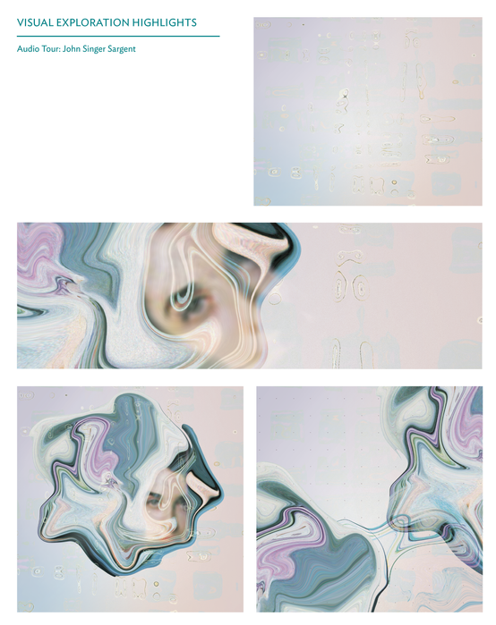
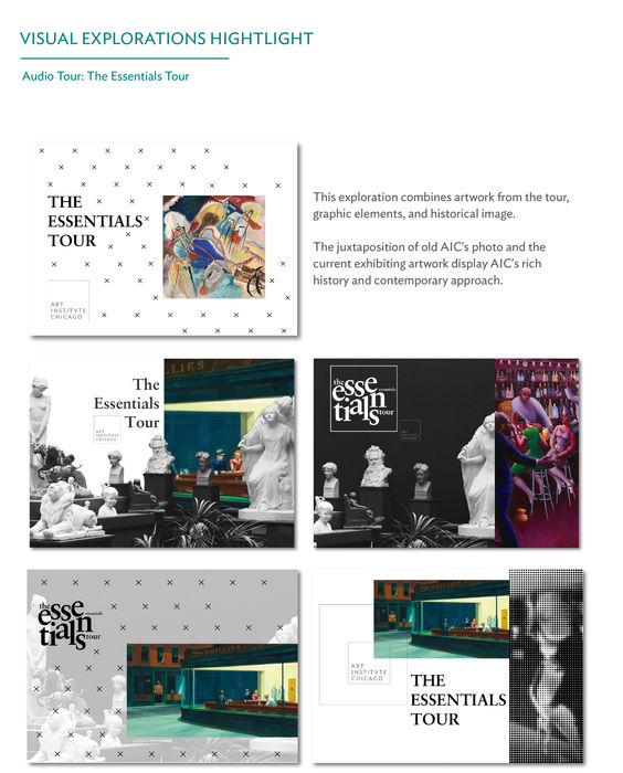
DEVELOPED VISUAL EXPLORATION
Audio Tour: A Beautiful Science: The Evolution of Chinese Porcelain
More Exploration Ideas
Click to enlarge the images
DESIGN PROCESS


bottom of page


